Visualization and Plotting
Ossify's plotting functions turn skeleton data into 2D figures where features like compartment, radius, and branching complexity map to visual properties (color, line width). The goal is publication-quality figures with precise scaling and clean styling, directly from your analysis.
Ossify supports both 2D plotting (via matplotlib) and 3D interactive rendering (via PyVista). The 3D functions require an optional dependency — install it with pip install ossify[viz].
Basic Skeleton Plotting
Simple 2D Projections
import ossify
import matplotlib.pyplot as plt

# Load a real neuron from the example dataset
cell = ossify.load_cell('https://github.com/ceesem/ossify/raw/refs/heads/main/864691135336055529.osy')

# Basic 2D plot
fig, ax = plt.subplots(figsize=(8, 6))
ossify.plot_morphology_2d(cell, projection="xy", ax=ax)
ax.set_title("Basic Skeleton Plot")
plt.show()
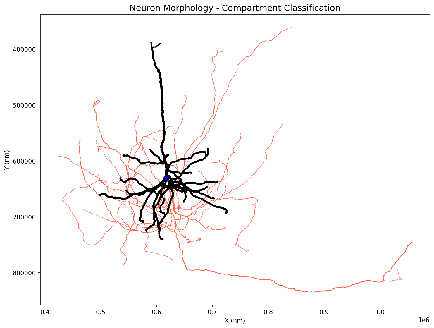
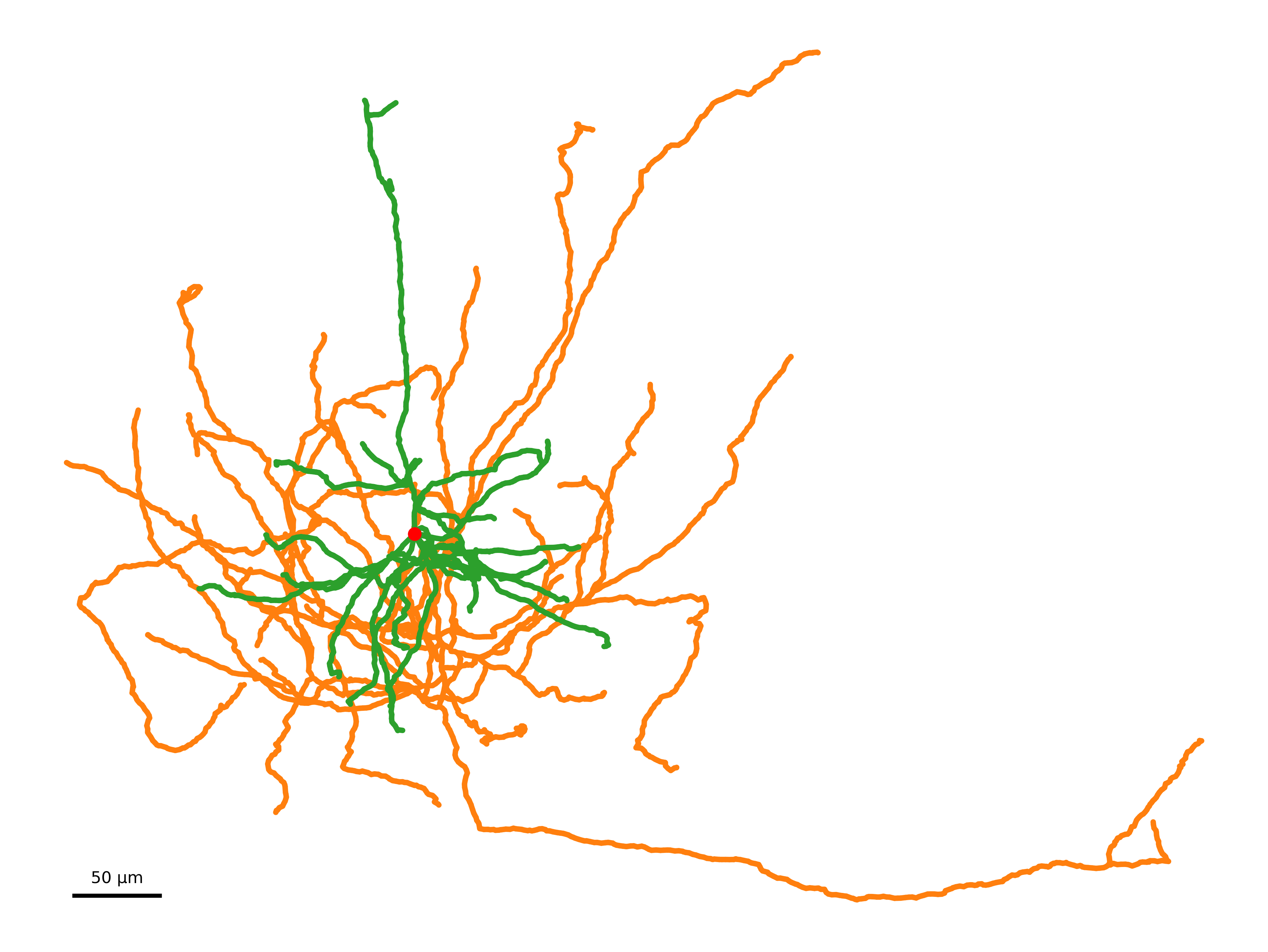
Example showing a real neuron with compartment classification: blue (axon), red (dendrite), black (soma).
Different Projections
# Plot different 2D projections
projections = ["xy", "xz", "yz"]
fig, axes = plt.subplots(1, 3, figsize=(15, 5))

for i, proj in enumerate(projections):
    ossify.plot_morphology_2d(
        cell,
        projection=proj,
        ax=axes[i]
    )
    axes[i].set_title(f"Projection: {proj}")
    axes[i].set_aspect("equal")

plt.tight_layout()
plt.show()
Styling and Customization
Color-Coded Visualization
# Add algorithmic analysis for visualization
from ossify.algorithms import strahler_number
strahler_vals = strahler_number(cell)
cell.skeleton.add_feature(strahler_vals, 'strahler_number')

# Color by Strahler order (branching complexity)
fig, ax = plt.subplots(figsize=(10, 8))
ossify.plot_morphology_2d(
    cell,
    projection="xy",
    color="strahler_number",      # Color by Strahler order
    palette="viridis",            # Colormap
    ax=ax
)
ax.set_title("Strahler Order Analysis")
plt.show()
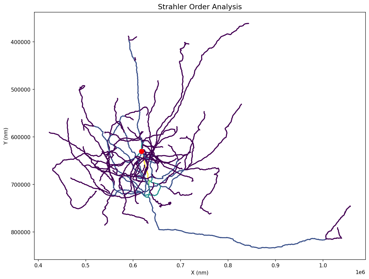
Strahler order analysis showing branching complexity. Higher orders (yellow) represent main stems, lower orders (purple) represent fine branches.
# Color by continuous variable (radius)
fig, ax = plt.subplots(figsize=(10, 8))
ossify.plot_morphology_2d(
    cell,
    projection="xy",
    color="radius",               # Color by radius
    palette="plasma",             # Colormap
    linewidth="radius",           # Width also varies with radius
    linewidth_norm=(100, 500),    # Radius range for normalization
    widths=(0.5, 8),             # Final line width range
    ax=ax
)
ax.set_title("Radius Variation")
plt.show()
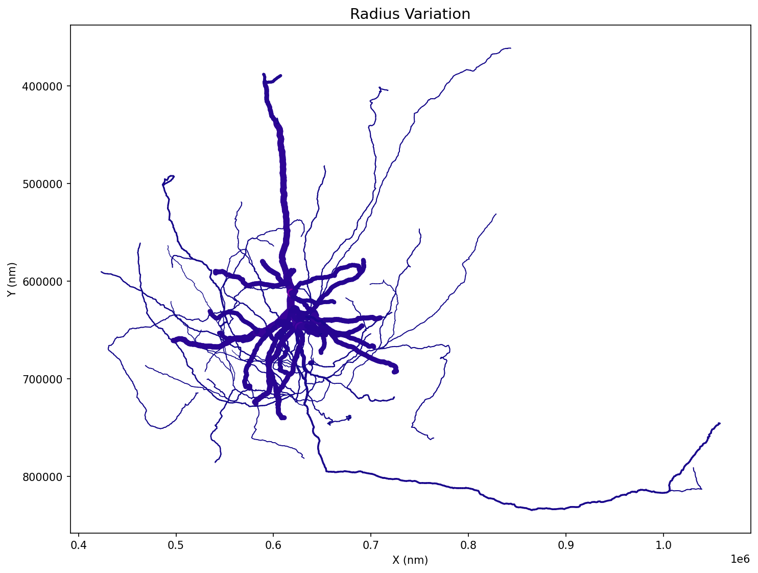
Radius variation shown through both color and line width. Thicker, brighter lines indicate larger radii.
Line Width and Transparency
# Variable line width based on radius
fig, ax = plt.subplots(figsize=(10, 8))
ossify.plot_morphology_2d(
    cell,
    projection="xy",
    linewidth="radius",           # Width proportional to radius
    widths=(1, 10),              # Min/max line widths
    color="compartment",
    palette={"0": "skyblue", "1": "orange"},
    ax=ax
)
ax.set_title("Variable Line Width")
plt.show()

# Transparency effects
fig, ax = plt.subplots(figsize=(10, 8))
ossify.plot_morphology_2d(
    cell,
    projection="xy",
    alpha=0.7,                   # Semi-transparent
    color="compartment",
    palette={"0": "blue", "1": "red"},
    ax=ax
)
ax.set_title("Semi-Transparent Rendering")
plt.show()
Root Markers
# Highlight the root vertex
fig, ax = plt.subplots(figsize=(10, 8))
ossify.plot_morphology_2d(
    cell,
    projection="xy",
    color="compartment",
    palette={"0": "blue", "1": "red"},
    root_marker=True,            # Show root marker
    root_size=200,               # Root marker size
    root_color="gold",           # Root marker color
    ax=ax
)
ax.set_title("Skeleton with Root Marker")
plt.show()
Multi-View Visualization
Three-Panel Layouts
# Automatic multi-view figure
axes = ossify.plot_cell_multiview(
    cell,
    layout="three_panel",        # xy, xz, zy views
    color="compartment",
    palette={1: 'navy', 2: 'tomato', 3: 'black'},
    linewidth="radius",
    linewidth_norm=(100, 500),
    widths=(0.5, 3),
    units_per_inch=100_000,      # Scale factor
    despine=True                 # Clean appearance
)

# axes is a dictionary: {"xy": ax1, "xz": ax2, "zy": ax3}
view_titles = {"xy": "Front View (XY)", "xz": "Side View (XZ)", "zy": "Side View (ZY)"}
for proj, ax in axes.items():
    ax.set_title(view_titles[proj])

plt.show()
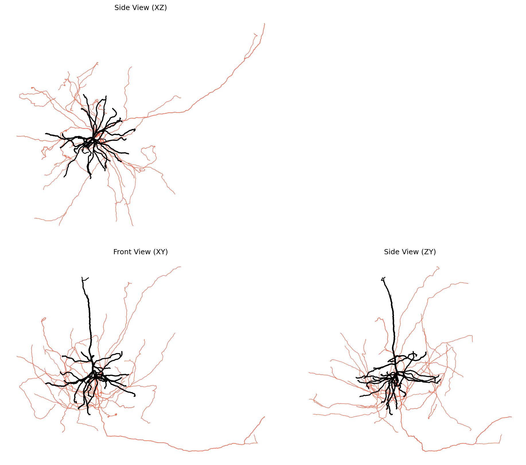
Three-panel layout showing the same neuron from different angles. This comprehensive view reveals the 3D structure and spatial organization of compartments.
Side-by-Side and Stacked Layouts
# Side-by-side layout (xy | zy)
fig, axes = ossify.plot_cell_multiview(
    cell,
    layout="side_by_side",
    color="radius",
    palette="plasma",
    units_per_inch=15
)

# Stacked layout (xz over xy)
fig, axes = ossify.plot_cell_multiview(
    cell,
    layout="stacked",
    color="compartment",
    palette={"0": "green", "1": "purple"},
    units_per_inch=12
)
Advanced Plotting Features
Custom Color Palettes
# Discrete color mapping
compartment_colors = {
    0: "#2E86AB",    # Blue for dendrite
    1: "#A23B72",    # Pink for axon
}

fig, ax = plt.subplots(figsize=(10, 8))
ossify.plot_morphology_2d(
    cell,
    color="compartment",
    palette=compartment_colors,
    linewidth="radius",
    widths=(2, 8),
    ax=ax
)

# Continuous colormap with normalization
fig, ax = plt.subplots(figsize=(10, 8))
ossify.plot_morphology_2d(
    cell,
    color="radius",
    palette="coolwarm",
    color_norm=(0.5, 2.5),       # Custom color range
    ax=ax
)
Value Transforms (log, sqrt, cbrt)
When a feature spans several orders of magnitude — synapse counts, branch
radii, depth — a linear colormap mapping wastes most of the dynamic range
on the largest values. Use color_scale (or size_scale on annotations)
to transform values before they hit the colormap. The color_norm /
size_norm bounds stay in original units, so you can think and write in
the data's native space:
# Log color scale for radius (handles thin axon → thick soma sweep)
fig, ax = plt.subplots(figsize=(10, 8))
ossify.plot_morphology_2d(
    cell,
    color="radius",
    palette="viridis",
    color_scale="log",            # log-transform values before colormap
    color_norm=(100, 5000),       # bounds in original (nm) units
    ax=ax,
)

# Log size scale for synapse counts
fig, ax = plt.subplots(figsize=(10, 8))
ossify.plot_annotations_2d(
    cell.annotations["pre_syn"],
    color="count",
    color_scale="log",            # color also log-transformed
    color_norm=(1, 1000),
    size="count",
    size_scale="log",
    sizes=(5, 80),                # output marker size range
    ax=ax,
)

# Sqrt size scale for area-like features (radius ∝ √area)
fig, ax = plt.subplots(figsize=(10, 8))
ossify.plot_annotations_2d(
    cell.annotations["synapses"],
    size="cross_section_area",
    size_scale="sqrt",
    sizes=(2, 50),
    ax=ax,
)

# In plot_cell_2d, the synapse transforms have separate keywords so the
# skeleton and synapses can be transformed independently.
ossify.plot_cell_2d(
    cell,
    color="radius",
    color_scale="log",            # skeleton color transform
    synapses="both",
    pre_color="count",
    syn_color_scale="log",        # synapse color transform
    syn_size="count",
    syn_size_scale="log",         # synapse size transform
)
These transforms match the corresponding 3D functions (plot_morphology_3d,
plot_annotations_3d, plot_cell_3d), so the same call pattern works in
either rendering backend.
size and sizes in 2D vs. 3D
The 2D and 3D synapse-sizing APIs share keyword names but the output units differ between backends:
- 2D (
plot_annotations_2d,plot_cell_2d):sizesis in matplotlib marker units (points², followingscatter(s=…)). The defaults(1, 30)or(5, 80)are points² regardless of what units your data is in. - 3D (
plot_annotations_3d,plot_cell_3d):sizesis in world units — the same units as your cell's vertex coordinates (nm/µm/voxels). Whensizes=Nonethe 3D backend auto-scales from the annotation's bounding box.
The input keywords (size, size_norm, size_scale) behave the
same in both backends and live in the feature's units. See the 3D
section below for the full table.
Projection Customization
# Y-axis inversion for image-like coordinates
fig, ax = plt.subplots(figsize=(10, 8))
ossify.plot_morphology_2d(
    cell,
    projection="xy",
    invert_y=True,               # Invert y-axis
    color="compartment",
    palette={"0": "blue", "1": "red"},
    ax=ax
)

# Custom projection function
def custom_projection(vertices):
    """Custom projection: rotate and scale."""
    angle = np.pi / 4  # 45 degrees
    rotation = np.array([
        [np.cos(angle), -np.sin(angle)],
        [np.sin(angle), np.cos(angle)]
    ])
    xy_coords = vertices[:, [0, 1]]  # Extract x, y
    rotated = xy_coords @ rotation.T
    return rotated * 2  # Scale by 2

fig, ax = plt.subplots(figsize=(10, 8))
ossify.plot_morphology_2d(
    cell,
    projection=custom_projection,
    color="radius",
    palette="viridis",
    ax=ax
)
ax.set_title("Custom Projection")
Rotation helpers
Hand-rolling a projection is fine but verbose. For the common case of
"rotate the cell about an axis to a better viewing angle," Rotation and
RotateCell build a projection callable for you:
from ossify.plot import Rotation, RotateCell

# Rotate 30° about the y-axis through the soma
proj = Rotation(cell.skeleton.root_location, axis="y", angle=30)
ossify.plot.plot_cell_2d(cell, projection=proj)

# Let PCA pick the best rotation angle about a given axis
proj = RotateCell(cell, axis="y", angle="best")
ossify.plot.plot_cell_2d(cell, projection=proj)

# Or fully automatic: PCA finds both the axis and the angle
proj = RotateCell(cell)
ossify.plot.plot_cell_2d(cell, projection=proj)
RotateCell defaults the rotation center to the skeleton root location
and supports "best" for axis and/or angle, which fits a PCA to the
skeleton vertices. Pass new_center=np.array([0, 0]) to position the
projected center at a specific 2D location — useful when laying out
multiple cells side-by-side.
Spatial Offsets
# Plot multiple cells with offsets
cells = [cell]  # In practice, you'd have multiple cells

fig, ax = plt.subplots(figsize=(12, 8))

offsets = [(0, 0), (30, 0), (60, 0)]  # Horizontal spacing
colors = ["blue", "red", "green"]

for i, (cell_to_plot, offset, color) in enumerate(zip(cells * 3, offsets, colors)):
    ossify.plot_morphology_2d(
        cell_to_plot,
        projection="xy",
        offset_h=offset[0],          # Horizontal offset
        offset_v=offset[1],          # Vertical offset
        color=color,
        alpha=0.8,
        ax=ax
    )

ax.set_title("Multiple Cells with Offsets")
ax.set_aspect("equal")
plt.show()
Publication-Quality Figures
Precise Sizing and Scaling
# Convert to micrometers for better scale
display_cell = cell.transform(lambda x: x / 1000)
display_cell.name = f"{cell.name}_display"

# Create figure with exact physical dimensions
fig, ax = ossify.single_panel_figure(
    data_bounds_min=display_cell.skeleton.bbox[0],    # Data bounds
    data_bounds_max=display_cell.skeleton.bbox[1],
    units_per_inch=50,           # 50 μm per inch
    despine=True,                # Clean appearance
    dpi=300                      # High resolution
)

ossify.plot_morphology_2d(
    display_cell,
    projection="xy",
    color="compartment",
    palette={1: '#1f77b4', 2: '#ff7f0e', 3: '#2ca02c'},
    linewidth="radius",
    linewidth_norm=(0.1, 0.5),  # Adjusted for μm scale
    widths=(0.5, 4),
    root_marker=True,
    root_color='red',
    ax=ax
)

# Add scale bar
ossify.add_scale_bar(
    ax=ax,
    length=50,                   # 50 μm scale bar
    position=(0.05, 0.05),       # Position as fraction of axes
    color="black",
    linewidth=3,
    feature="50 μm",
    fontsize=12
)

plt.savefig("publication_figure.png", dpi=300, bbox_inches="tight")
plt.show()
Publication-quality figure with precise scaling, clean styling, and scale bar. The coordinate system has been converted to micrometers for appropriate scale representation.
Multi-Panel Publication Figures
# Create publication-ready multi-panel figure
fig, axes = ossify.multi_panel_figure(
    data_bounds_min=cell.skeleton.bbox[0],
    data_bounds_max=cell.skeleton.bbox[1],
    units_per_inch=100,
    layout="three_panel",
    gap_inches=0.3,              # Gap between panels
    despine=True,
    dpi=300
)

# Plot same cell in all views with consistent styling
for proj, ax in axes.items():
    ossify.plot_morphology_2d(
        cell,
        projection=proj,
        color="compartment",
        palette={"0": "#1f77b4", "1": "#ff7f0e"},  # Professional colors
        linewidth="radius",
        widths=(1, 4),
        root_marker=True,
        root_size=100,
        root_color="black",
        ax=ax
    )

    # Add scale bar to xy view only
    if proj == "xy":
        ossify.add_scale_bar(
            ax=ax,
            length=5,
            position=(0.8, 0.05),
            feature="5 μm",
            fontsize=10
        )

plt.savefig("multiview_figure.pdf", dpi=300, bbox_inches="tight")
plt.show()
Styling labels in lineups and layer guides
plot_lineup_grid and add_layer_lines both accept a *_kwargs dict
that is forwarded directly to matplotlib's Axes.text call. Anything
text(...) accepts works — font family, size, weight, style, color,
custom FontProperties, even mathtext / LaTeX strings.
from ossify.plot import plot_lineup_grid, add_layer_lines, LineupGroup

# Group labels: pass a dict to `group_label_kwargs`.
ax = plot_lineup_grid(
    [
        LineupGroup(cells_l2a, label="L2a", **L2A_STYLE),
        LineupGroup(cells_l2b, label="L2b", **L2B_STYLE),
    ],
    inter_cell_gap=10_000,
    inter_group_gap=30_000,
    units_per_inch=200_000,
    group_label_offset=20_000,
    group_label_kwargs=dict(
        fontfamily="serif",
        fontsize=14,
        fontweight="bold",
        color="#222222",
    ),
    layer_lines={0: "L1", 250_000: "L2/3", 500_000: "L4"},
    layer_line_kwargs=dict(
        # `add_layer_lines` keyword args go in here:
        label_kwargs=dict(
            fontfamily="serif",
            fontsize=11,
            fontstyle="italic",
            color="gray",
        ),
        line_kwargs=dict(
            linestyle=":",
            color="lightgray",
            linewidth=0.4,
        ),
        label_pad=0.02,           # left margin between axis edge and label
    ),
)
Each *_kwargs dict is merged on top of the function's own defaults,
so you only need to specify what you want to change. The convenience
shortcut args on add_layer_lines (color, linestyle, linewidth,
label_fontsize) seed the defaults; the label_kwargs / line_kwargs
dicts override them where they overlap.
A few practical notes:
- Mathtext / TeX — label strings go through
ax.textsolabel=r"$\mathrm{L2/3}$"works without extra setup. Setmatplotlib.rcParams["text.usetex"] = Truefirst if you want true LaTeX rendering (slower; pulls in your system TeX installation). fontfamilyis a soft match — matplotlib looks for a generic family ("serif","sans-serif","monospace") or a specific installed font. For exact control, build amatplotlib.font_manager.FontProperties(family="...", size=..., weight=...)once and pass it asfontproperties=fpin the same*_kwargsdict.-
Common style applied to both labels — there's no single master-style knob; if you want identical fonts for group labels and layer labels, define the dict once and pass it to both:
Working with Real Data
CAVEclient Data Visualization
# Visualize data loaded from CAVEclient
# (Assuming cell loaded with ossify.load_cell_from_client)

if hasattr(cell, 'skeleton') and cell.skeleton is not None:
    # Convert from nanometers to micrometers for display
    display_cell = cell.transform(lambda x: x / 1000)
    display_cell.name = f"{cell.name}_display"

    # Plot with appropriate scaling
    fig, ax = ossify.single_panel_figure(
        data_bounds_min=display_cell.skeleton.bbox[0],
        data_bounds_max=display_cell.skeleton.bbox[1],
        units_per_inch=50,  # 50 μm per inch
        despine=True
    )

    # Color by compartment if available
    color_by = "compartment" if "compartment" in display_cell.skeleton.feature_names else None

    ossify.plot_morphology_2d(
        display_cell,
        color=color_by,
        palette={"0": "blue", "1": "red"} if color_by else "black",
        linewidth="radius" if "radius" in display_cell.skeleton.feature_names else 2,
        ax=ax
    )

    # Add scale bar in micrometers
    ossify.add_scale_bar(
        ax=ax,
        length=50,  # 50 μm
        position=(0.1, 0.1),
        feature="50 μm",
        color="black"
    )
Algorithm Results Visualization
# Visualize results of morphological analysis
import ossify

# Compute Strahler numbers
strahler = ossify.strahler_number(cell)
cell.skeleton.add_feature(strahler, name="strahler")

# Create figure showing Strahler analysis
fig, axes = plt.subplots(1, 2, figsize=(16, 8))

# Original morphology
ossify.plot_morphology_2d(
    cell,
    projection="xy",
    color="compartment",
    palette={"0": "blue", "1": "red"},
    linewidth="radius",
    widths=(1, 6),
    ax=axes[0]
)
axes[0].set_title("Compartment Classification")

# Strahler analysis
ossify.plot_morphology_2d(
    cell,
    projection="xy",
    color="strahler",
    palette="viridis",
    linewidth=3,
    ax=axes[1]
)
axes[1].set_title("Strahler Order")

plt.tight_layout()
plt.show()
Integrating with Analysis Workflows
Before and After Comparison
# Demonstrate masking visualization
fig, axes = plt.subplots(1, 2, figsize=(16, 8))

# Original morphology
ossify.plot_morphology_2d(
    cell,
    projection="xy",
    color='compartment',
    palette={1: 'lightblue', 2: 'lightcoral', 3: 'lightgray'},
    linewidth=2,
    ax=axes[0]
)
axes[0].set_title("Complete Morphology")

# Dendrite only (compartment == 3)
with cell.mask_context('skeleton', cell.skeleton.features['compartment'] == 3) as masked_cell:
    ossify.plot_morphology_2d(
        masked_cell,
        projection="xy",
        color='black',
        linewidth=3,
        ax=axes[1]
    )
axes[1].set_title("Dendrite Only (Masked)")

for ax in axes:
    ax.set_xlabel("X (nm)")
    ax.set_ylabel("Y (nm)")

plt.tight_layout()
plt.show()
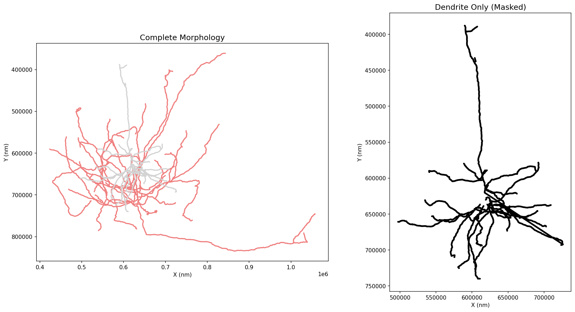
Masking visualization showing the complete morphology (left) and filtered dendrite compartment (right). Masking enables focused analysis on specific cellular regions.
Masking Visualization
# Visualize masking results
def plot_masked_comparison(cell, mask, mask_name="Mask"):
    """Show original vs masked data."""

    masked_cell = cell.apply_mask("skeleton", mask, as_positional=True)

    fig, axes = plt.subplots(1, 2, figsize=(16, 8))

    # Original with mask highlighted
    colors = ["lightgray" if not m else "red" for m in mask]
    ossify.plot_morphology_2d(
        cell,
        projection="xy",
        color=colors,
        linewidth=2,
        ax=axes[0]
    )
    axes[0].set_title(f"Original (highlighted: {mask_name})")

    # Masked result
    ossify.plot_morphology_2d(
        masked_cell,
        projection="xy",
        color="blue",
        linewidth=3,
        ax=axes[1]
    )
    axes[1].set_title(f"Masked Result")

    plt.tight_layout()
    return fig, axes

# Example usage
# quality_mask = cell.skeleton.get_feature("quality") > 0.8
# plot_masked_comparison(cell, quality_mask, "High Quality")
Key Plotting Functions
Core Plotting Functions
ossify.plot_morphology_2d(cell, projection="xy", color=None, palette="coolwarm", ...)- Main 2D plotting functionossify.plot_cell_multiview(cell, layout="three_panel", ...)- Multi-view layouts
Figure Creation
ossify.single_panel_figure(data_bounds_min, data_bounds_max, units_per_inch, ...)- Precise single panelossify.multi_panel_figure(data_bounds_min, data_bounds_max, units_per_inch, layout, ...)- Multi-panel layouts
Enhancements
ossify.add_scale_bar(ax, length, position=(0.05, 0.05), feature=None, ...)- Add scale bars
Projection Options
- Standard projections:
"xy","xz","yz","yx","zx","zy" - Custom projection functions that take vertices and return 2D coordinates
Styling Parameters
color- feature name, array, or single colorpalette- Colormap name or color dictionarylinewidth- feature name, array, or single valuealpha- Transparency (0-1)root_marker- Show root vertex markerinvert_y- Invert y-axis for projections containing 'y'
2D Plotting Best Practices
- Use
units_per_inchfor consistent scaling across figures - Apply coordinate conversions (nm → μm) for appropriate scale bars
- Use
despine=Truefor clean publication figures - Set high DPI (300+) for publication-quality output
- Color by meaningful biological properties (compartment, Strahler order)
- Add scale bars with appropriate units for the data scale
3D Visualization
The 3D functions use PyVista as the rendering backend and return a pv.Plotter that can be displayed interactively or embedded in a notebook. Install the extra with:
Full Cell — plot_cell_3d
Renders skeleton, optional mesh surface, and optional synapses in a single call:
import ossify
from ossify.plot3d import plot_cell_3d

cell = ossify.load_cell("neuron.osy")

# Skeleton only
pl = plot_cell_3d(cell, color="compartment", palette="coolwarm")

# Skeleton + semi-transparent mesh
pl = plot_cell_3d(
    cell,
    color="strahler_order",
    mesh=True,
    mesh_opacity=0.3,          # semi-transparent so skeleton shows through
    mesh_color="white",
)

# Skeleton + synapses with per-synapse coloring
pl = plot_cell_3d(
    cell,
    synapses="both",
    pre_color="red",
    post_color="blue",
    syn_size="size",           # radius mapped from a feature
    syn_sizes=(50, 500),       # output radius range (world units!)
    syn_size_scale="log",      # log-transform size values
)

pl.show()
syn_size and syn_sizes are in different units
This trips up almost everyone the first time. The synapse-sizing
keywords on plot_cell_3d (and the matching size/sizes on
plot_annotations_3d) split cleanly into input and output:
| Keyword | Role | Units |
|---|---|---|
syn_size (size) |
input feature | whatever your feature is stored in (e.g. voxel counts, raw size values) |
syn_size_norm (size_norm) |
input clip | same units as the feature |
syn_size_scale (size_scale) |
input xform | — ("log" / "sqrt" / "cbrt") |
syn_sizes (sizes) |
output radius | world units — same as your cell's vertex coordinates (nm/µm/voxels) |
For a cell stored in nm, syn_sizes=(300, 2000) gives spheres
of 0.3–2 µm radius. For a cell in µm, write syn_sizes=(0.3, 2.0)
for the same physical size. Pass syn_sizes=None (the default) and
ossify auto-scales from the synapse bounding box — works at any unit.
syn_size_norm is always in the input feature's units regardless of
what the cell coordinates are in.
Mesh Surface — plot_mesh_3d
Renders a MeshLayer as a colored surface:
from ossify.plot3d import plot_mesh_3d

# Uniform color
pl = plot_mesh_3d(cell.mesh, color="lightgray", opacity=0.5)

# Feature-driven coloring
pl = plot_mesh_3d(
    cell.mesh,
    color="area",              # per-vertex feature name
    palette="plasma",
    color_norm=(0, 10000),     # clamp to 5th–95th percentile range
)

# Log-scale coloring
pl = plot_mesh_3d(
    cell.mesh,
    color="area",
    color_scale="log",         # log-transform before colormap
    color_norm=(100, 50000),   # bounds in original space
)
pl.show()
Skeleton Morphology — plot_morphology_3d
Feature-driven coloring and variable-radius tubes on a skeleton or cell:
from ossify.plot3d import plot_morphology_3d

pl = plot_morphology_3d(
    cell,
    color="strahler_order",
    palette="viridis",
    tube_radius="radius",      # per-vertex tube radius from feature
    tube_radius_scale=1/1000,  # nm → μm
    tube_radii=(0.1, 5.0),    # output radius range (μm)
)
pl.show()
Annotations — plot_annotations_3d
Renders a PointCloudLayer as sphere glyphs:
from ossify.plot3d import plot_annotations_3d

pl = plot_annotations_3d(
    cell.annotations["pre_syn"],
    color="size",
    color_scale="log",
    color_norm=(275, 5771),    # 5th–95th percentile, in feature units
    size="size",
    size_scale="log",
    sizes=(50, 500),           # output radius range in WORLD units (nm here)
)
pl.show()
size vs sizes units
size (the input feature) lives in whatever units the feature
stores. sizes (the output radius range) lives in world units —
the same units as the annotation's vertex coordinates. See the
plot_cell_3d section for a full table.
When in doubt, leave sizes=None and let ossify auto-scale from the
annotation bounding box.
Graph Networks — plot_graph_3d
Renders a GraphLayer as node glyphs and edge tubes. All properties live on vertices; tube colors and radii are interpolated between the two endpoint values:
from ossify.plot3d import plot_graph_3d

pl = plot_graph_3d(
    cell.graph,
    node_color="weight",
    node_palette="coolwarm",
    node_size="weight",
    node_sizes=(20, 200),
    edge_color="weight",       # interpolated along each tube
    edge_radius=5.0,
)
pl.show()
Compositing layers
All 3D functions accept a plotter= keyword so you can compose multiple layers into one scene:
pl = plot_morphology_3d(cell, color="compartment")
pl = plot_mesh_3d(cell.mesh, opacity=0.2, plotter=pl)
pl = plot_annotations_3d(cell.annotations["pre_syn"], color="red", plotter=pl)
pl.show()
Colorbars — add_colorbar_3d
Because ossify pre-maps scalar values to RGB colors, PyVista has no colormap
information to generate a scalar bar automatically. add_colorbar_3d adds
one explicitly:
from ossify.plot3d import plot_morphology_3d, add_colorbar_3d

pl = plot_morphology_3d(cell, color="strahler_order", palette="viridis")
add_colorbar_3d(pl, palette="viridis", color_norm=(1, 7), label="Strahler order")
pl.show()
Multiple colorbars can be added to the same plotter — adjust position_x to
avoid overlap:
pl = plot_morphology_3d(cell, color="depth", palette="plasma")
pl = plot_annotations_3d(
    cell.annotations["pre_syn"], color="size", palette="coolwarm", plotter=pl,
)
add_colorbar_3d(pl, palette="plasma", color_norm=(0, 500), label="Depth (µm)",
                position_x=0.85)
add_colorbar_3d(pl, palette="coolwarm", color_norm=(275, 5771), label="Syn size",
                position_x=0.72)
pl.show()
Orbit Animations — orbit_3d
orbit_3d spins the camera around the scene — either interactively or saved
to a file:
from ossify.plot3d import plot_cell_3d, orbit_3d

pl = plot_cell_3d(cell, color="red", tube_radius=500)

# Interactive orbit
orbit_3d(pl)

# Save to GIF
orbit_3d(pl, output="neuron.gif", n_frames=90, elevation=20.0)

# Save to MP4 (higher quality, smaller file)
orbit_3d(pl, output="neuron.mp4", n_frames=120, framerate=30)
Use elevation to tilt the camera, factor to control how far the
camera sits from the scene, and viewup to choose the orbital axis:
viewup is the orbital axis
viewup is both the rotation axis (the orbital plane normal) and
the camera's up direction during the orbit. The two are tied
together intentionally — decoupling them causes the camera to flip
midway through the orbit, which visually reads as a 180° back-and-
forth oscillation instead of a full circle.
Common values:
viewup=(0, 0, 1)— orbit in the xy plane around the z axis (PyVista's default).viewup=(0, 1, 0)or(0, -1, 0)— orbit in the xz plane around the y axis. Useful when y is your depth axis (typical for cortical neurons).viewup=(1, 0, 0)— orbit in the yz plane around the x axis.
When viewup=None (default), orbit_3d reads the plotter's current
camera up vector. So if you've already set up the camera, that
orientation is preserved.
Higher-resolution output
orbit_3d accepts a window_size=(width, height) argument that
resizes the plotter's render window before recording. Useful for
publication-quality GIFs/MP4s:
pl = plot_cell_3d(cell, color="compartment", tube_radius="radius")
orbit_3d(
    pl,
    output="neuron_hires.mp4",
    n_frames=120,
    framerate=30,
    viewup=(0, 1, 0),                # rotate around the depth axis
    window_size=(1920, 1440),        # 4:3 HD frames
)
By default the plotter uses 1024 × 768 (or whatever was specified at
pv.Plotter(...) construction time). For static screenshots
(pl.screenshot(...)), you can pass scale=2 etc. to multiply the
window size further.
Reusing the plotter after orbiting
By default orbit_3d closes the plotter when the animation finishes, so
the returned plotter is no longer usable. Pass close=False to keep it
alive — useful when you want to add more actors after orbiting, capture
a still screenshot, or run another orbit: